Why you need to leave a g p in your copywriting

When it comes to copywriting, ‘Keep it simple’ is brilliant advice.
It’s bonkers how much information our poor little brains are expected to process. I’ve read that we’re exposed to anywhere between 4,000 and 10,00 marketing messages every day.
I counted at least 5 this morning, but then I got distracted. All I know is, when we’re told to keep our copywriting simple, it makes a lot of sense.
Edit those headlines down.
Only sell one thing at a time.
Make it easy to understand what you’re getting at.
All sage advice from the University of Write Not Wrong.
Simple is good, but…
Simple is a good start, but simplicity alone won’t always give you the cut-through you’re after.
You also need to be provocative, witty, different…
Simplicity is an elusive enough copywriting goal for most people, but the creative bit seems to be out of reach for the majority – thank goodness.
However, if you’re up for the challenge, there is one trick that’s great for transforming simple into something that people actually want to engage with.
I’m calling it ‘copywriting with a gap’ or to give it its official title, opywriting©.
Can you tell what it is yet?
People love to play. We love puzzles and a great example is the good old dot-to-dot.
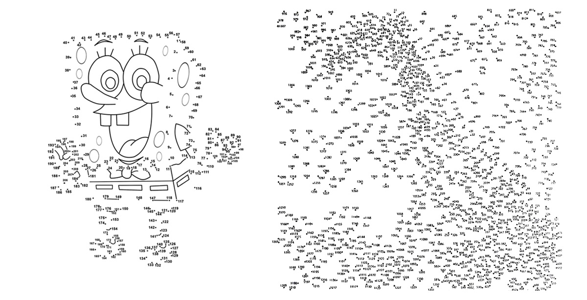
Giving your audience the space to get involved is a smart way to draw them in, but it’s a balancing act.
The two images above are a perfect demonstration of the ‘can’t be arsed because it’s too simple’ and the ‘can’t be arsed because it’s too complicated’.
The great thing about two extremes, is they’re all the proof you need that somewhere there’s a happy mid-point – the ‘ooh that looks like fun, I’m in’ sweet spot.
Yes, people are busy, so we need to get to the point, but there’s a lot to be said for leaving gaps so that they can join the dots.
We should never underestimate the intelligence of our audience
People love to be entertained, but they also love to be part of the entertainment. If they didn’t, there’d be no such thing as Karaoke.
Was it Confucius or Mr. Spock who said:
Tell me, I will forget
Show me, I will remember
Involve me, I will understand.
Whoever it was, I agree.
Having worked with kids in classrooms and summer camps, I’ve seen it a thousand times. Making stuff simple is great, but if they’re not part of the learning experience, nothing sinks in.
It’s the same with marketing and corporate comms. If we’re not careful, keeping everything simple leaves no room for people to have fun.
And that’s where the best copywriting gets it just right.
Genius copywriters keep it simple, but don’t lay everything out on a plate. There’s something in their writing that’s unexpected or curious. It gives the person reading it the reward of cracking the code.
A word of warning. If it’s worth a double take it’s good, but if it leaves them scratching their heads for too long, you’ve lost. Like I said, it’s a balancing act.
Two things to remember
1) Generally speaking, people don’t give a sticky fig about your ad / brochure / Instagram post… Your brand is just a means to an end.
2) Girls (and boys) just want to have fun.
If your copywriting can cater to these two basic principals, you’re more than halfway there.
You need to be able to answer ‘yes’ to these questions to be sure of any level of success:
– Is it simple?
– Is it entertaining, quirky, intriguing and/or impactful?
– Does it convey the message you’re after?
– Does it stop short of being self-indulgent?
And ‘no’ to these if you’re going to be belt, braces and safety pin certain-sure:
– Are you aiming too intellectually high or low for your audience?
– Could it be mistaken for a message from a competing brand?
– Could it be expressed even more simply with no loss of impact?
– Does it leave you thinking “so what”?
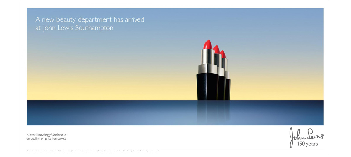
Posters are the ideal space for immediacy, with that all important splash of opywriting©. At least they ought to be.
Here’s a bunch of stonkers that cut to the chase, yet still give the viewer the chance to go on a little journey to the land of ‘Oh Yeah, I Get It’.
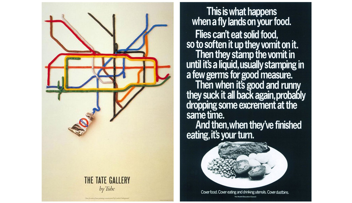
The public health ‘fly’ poster was pinned up in Doctor’s waiting rooms, hence the extra linger time. But lengthy headline aside, in essence it’s still incredibly simple. And the gap? No picture of a fly, no mention of diseases. It gives you just enough mental white space to do a bit of colouring in yourself.
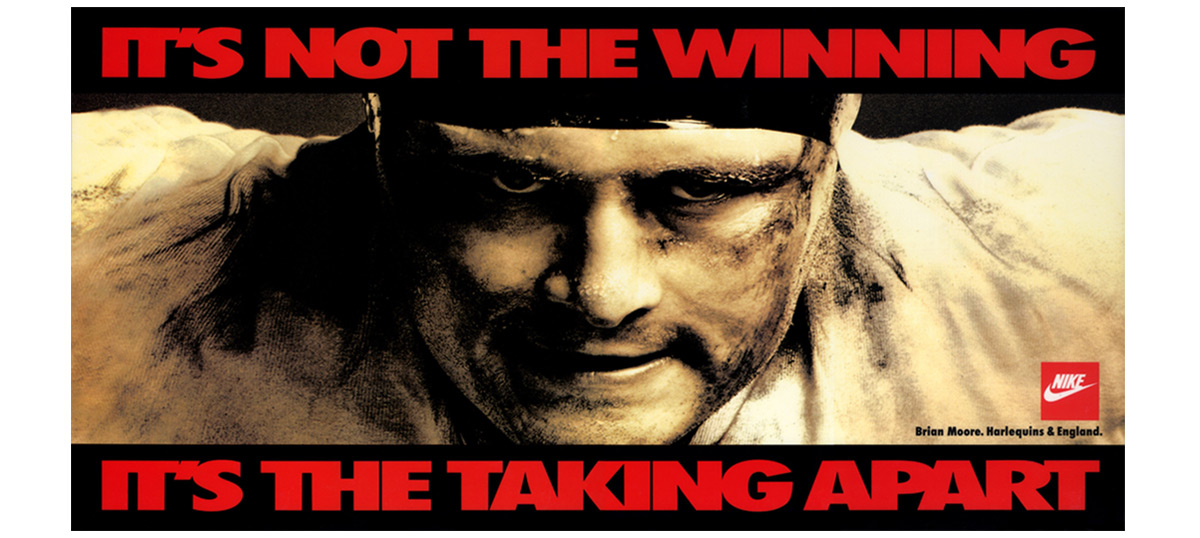
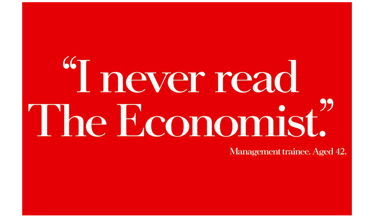
Sorry to be predictable, but no post on opywriting© could ignore this little beauty. A fab five-word headline and a four-word punchline with that magic little gap in between.
The golden rule – simple is good, but boring is bad.
So next time you’ve stripped your copy back to the bare essentials, before you pat yourself on the back for its brevity, ask if there’s something else you could do to give the reader a bit of play time. Where’s the gap?
You can find more on the art of copywriting right here.
Jonathan Wilcock (that’s me) is a Senior Freelance Copywriter.
You can drop me line here, or email jonathan@sowhatif.co.uk